Chapter 21 Multi-panel Plots
Welcome back to Quantitative Reasoning! In tutorial 14, we made this box plot of Edgar Anderson’s iris data.
boxplot(Sepal.Width ~ Species,
        data = iris,
        col = "lightgreen",
        ylab = "Sepal width (cm)",
        main = "Anderson's Iris Data")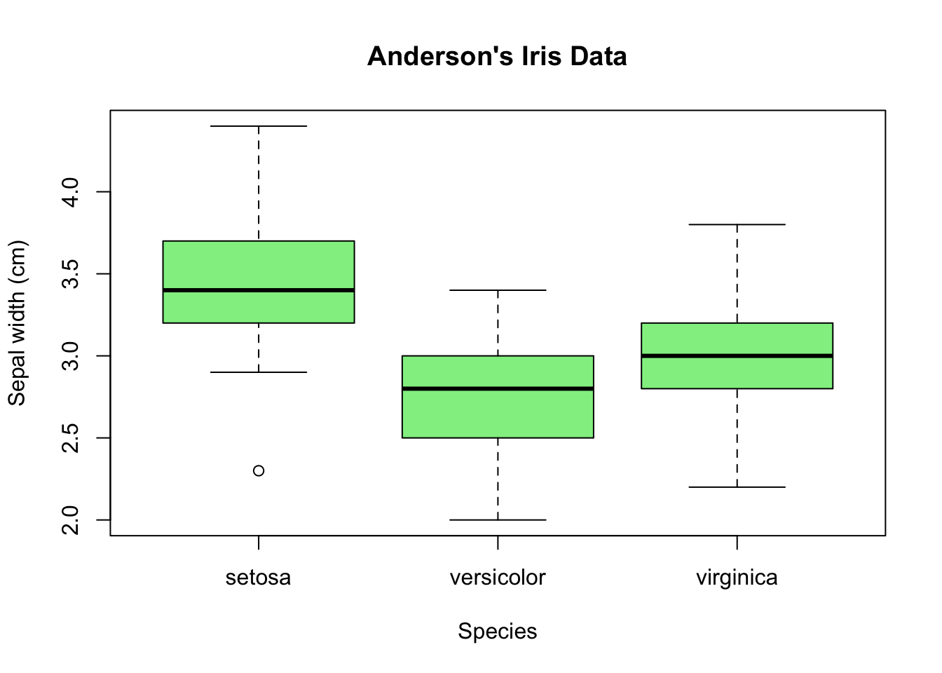
Multiple box plots are very efficient visualisations to compare distributions with each other because box plots condense the information into very few numbers: median, upper and lower quartiles, minimum and maximum, and outliers. Occasionally, we wish to see each distribution in more detail and still plot the distributions of the subsets next to each other. Histograms generally contain more information than box plots, so we make one histogram for each species. If we move the histograms close to each other, align the histograms vertically and use the same x-axis, we can easily draw comparisons.

For example, we can see that the peak in the distribution is between 3.3 cm and 3.4 cm for setosa, and between 2.9 cm and 3.0 cm for both versicolor and virginica.
I made this multi-panel plot with R, but I must admit that it isn’t a trivial task. It would take us too far off course to make a plot that looks exactly like this image. Instead, we will content ourselves with a simple strategy to make multi-panel plots. The results we can achieve with this simple method won’t have publication quality, but the plots are good enough for quick exploratory data analysis.
In our iris project from tutorial 14, let’s start a new script
iris_multipanel.R.
We first split the data by species.
Then we make a separate histogram for each species.
The aggregate() function from the previous tutorial doesn’t help us here
because our end product is a plot, not a data frame, so it’s better to simply
use square brackets for subsetting.
set <- iris$Sepal.Width[iris$Species == "setosa"]
ver <- iris$Sepal.Width[iris$Species == "versicolor"]
vir <- iris$Sepal.Width[iris$Species == "virginica"]
We can run hist() separately for set, ver and vir, but this strategy
creates by default three separate plots rather than one three-panel plot.
hist(set)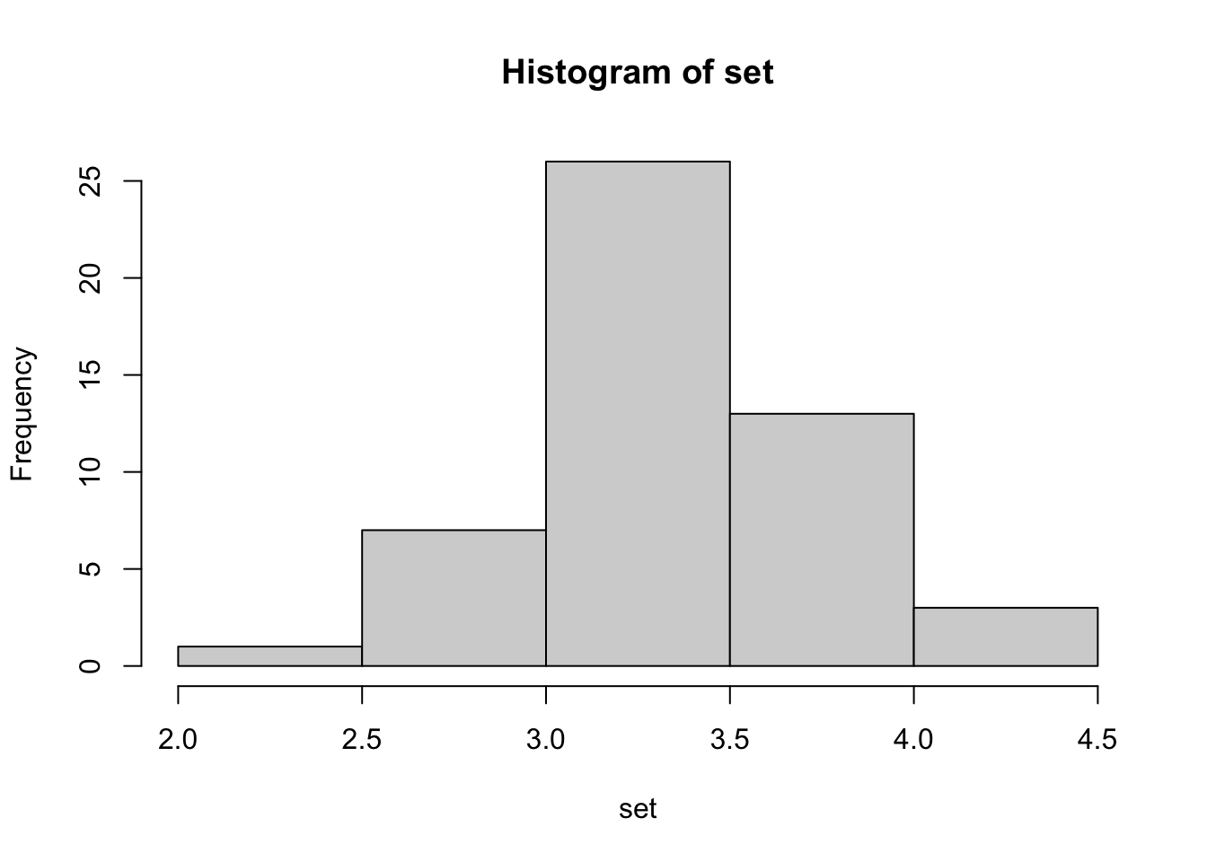
hist(ver)
hist(vir)
To make a multi-panel plot, we must change the R graphics parameter mfrow,
which stands for “multi-frame rowwise layout”.
We can change this parameter with the function par() and the argument
mfrow.
The value of mfrow is a numeric vector with two elements.
The first element is the number of rows in our plot, in our case 3.
The second element is the number of columns, in our example 1.
It’s good practice to reset mfrow to its default value c(1, 1) after we
made the plot because we don’t want the change to a three-row layout to be
permanent.
Let’s click on “Source” to carry out all lines in the script.
par(mfrow = c(3, 1))
hist(set)
hist(ver)
hist(vir)
par(mfrow = c(1, 1))Right now the histograms look very flat. Let’s maximize the height of the Plots tab to see the distributions more clearly.
par(mfrow = c(3, 1))
hist(set)
hist(ver)
hist(vir)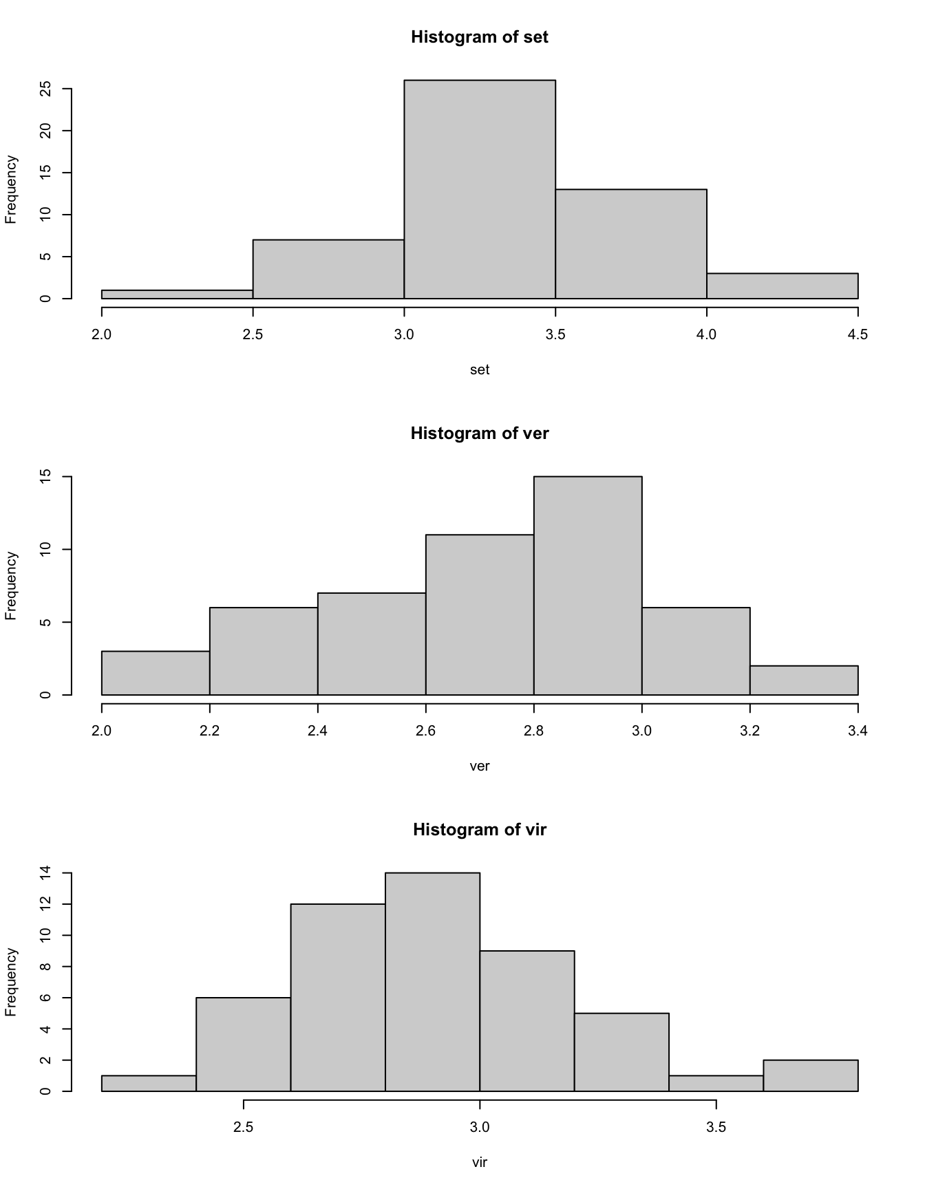
par(mfrow = c(1, 1))There are a few things we should improve.
Currently, all three histograms use different breaks between the bins.
This feature makes it difficult to compare the distributions with each other.
To fix this problem, we use the breaks argument that we encountered in
tutorial 15.
Because we want the same breaks in all three histograms, it’s best to
define the breaks as a variable (e.g. called iris_breaks) before calling
hist(), and then we insert this variable as the value of the breaks
argument in hist().
If we want to change the breaks at a later stage, it will be enough to change
the numbers in one place rather than in each hist() call separately.
par(mfrow = c(3, 1))
iris_breaks <- seq(1.8, 4.6, 0.1)
hist(set,
     breaks = iris_breaks)
hist(ver,
     breaks = iris_breaks)
hist(vir,
     breaks = iris_breaks)
par(mfrow = c(1, 1))Next we should change the range of the y-axes so that they are equal for all
histograms.
We fix the y-axis limits with the argument ylim.
Again, it’s best to define a variable up front (e.g. called iris_ylim) and
insert this variable in each call of hist().
par(mfrow = c(3, 1))
iris_breaks <- seq(1.8, 4.6, 0.1)
iris_ylim <- c(0, 12)
hist(set,
     breaks = iris_breaks,
     ylim = iris_ylim)
hist(ver,
     breaks = iris_breaks,
     ylim = iris_ylim)
hist(vir,
     breaks = iris_breaks,
     ylim = iris_ylim)
par(mfrow = c(1, 1))We should also change the x-axis label to something more meaningful than
set, ver and vir, for example “Sepal width (cm)”.
par(mfrow = c(3, 1))
iris_breaks <- seq(1.8, 4.6, 0.1)
iris_ylim <- c(0, 12)
iris_xlab <- "Sepal width (cm)"
hist(set,
     breaks = iris_breaks,
     ylim = iris_ylim,
     xlab = iris_xlab)
hist(ver,
     breaks = iris_breaks,
     ylim = iris_ylim,
     xlab = iris_xlab)
hist(vir,
     breaks = iris_breaks,
     ylim = iris_ylim,
     xlab = iris_xlab)
par(mfrow = c(1, 1))To polish the plot a little bit more, we can change the histogram titles with
main.
par(mfrow = c(3, 1))
iris_breaks <- seq(1.8, 4.6, 0.1)
iris_ylim <- c(0, 12)
iris_xlab <- "Sepal width (cm)"
hist(set,
     breaks = iris_breaks,
     ylim = iris_ylim,
     xlab = iris_xlab,
     main = "Setosa")
hist(ver,
     breaks = iris_breaks,
     ylim = iris_ylim,
     xlab = iris_xlab,
     main = "Versicolor")
hist(vir,
     breaks = iris_breaks,
     ylim = iris_ylim,
     xlab = iris_xlab,
     main = "Virginica")
par(mfrow = c(1, 1))As a final embellishment, we add a faint grid to each histogram so that we
can read off values more easily.
We simply add a grid to each histogram by calling the grid() function after
hist().
par(mfrow = c(3, 1))
iris_breaks <- seq(1.8, 4.6, 0.1)
iris_ylim <- c(0, 12)
iris_xlab <- "Sepal width (cm)"
hist(set,
     breaks = iris_breaks,
     ylim = iris_ylim,
     xlab = iris_xlab,
     main = "Setosa")
grid()
hist(ver,
     breaks = iris_breaks,
     ylim = iris_ylim,
     xlab = iris_xlab,
     main = "Versicolor")
grid()
hist(vir,
     breaks = iris_breaks,
     ylim = iris_ylim,
     xlab = iris_xlab,
     main = "Virginica")
grid()
par(mfrow = c(1, 1))Compared to the plot I showed at the beginning of this tutorial, this plot still leaves much to be desired. The top two histograms don’t really need their own x-axis, and the three y-axes don’t need three separate y-axis labels. There’s also too much space between the panels. On top of these problems, the code is repetitive. All of these issues can be solved with free add-on R packages, but their syntax is beyond the scope of this course. Although the solution I have shown you isn’t perfect, it will be good enough for exploratory data analysis.
Here is a summary of what we learned in this tutorial.
- We can make make multi-panel plots by changing the parameter
mfrow. - We change
mfrowwith the commandpar(mfrow = c(..., ...)). The first argument inside thec()function is the number of rows in the plot. The second argument is the number of columns. - We should reset
mfrowto its defaultc(1, 1)after we made a multi-panel plot. Otherwise all following plots would also have a multi-panel layout. - Usually it’s a good idea to use the same x-axis range and the same y-axis
range in all panels.
For histograms, we can adjust the x-axis range with the
breaksargument. In other types of plots, we use thexlimargument instead. The y-axis range is adjusted by theylimargument in all plot types. - We add a faint grid to a plot by running the function
grid()after the plotting command (e.g.hist()). Grids are generally a nice addition to most plots. They are particularly effective in multi-panel plots because we can more easily make comparisons between the panels.
In our next tutorial, we encounter new types of plots. We learn how to make scatter plots and line charts.
See you soon.