Chapter 15 Histogram
Welcome back to Quantitative Reasoning! Last time we learned how to make box plots, a visual way to summarise quantitative data. In this tutorial, we’ll learn how to make histograms, which display more detailed information about a distribution than box plots.
We’re going to use the data in the preinstalled iris data frame again.
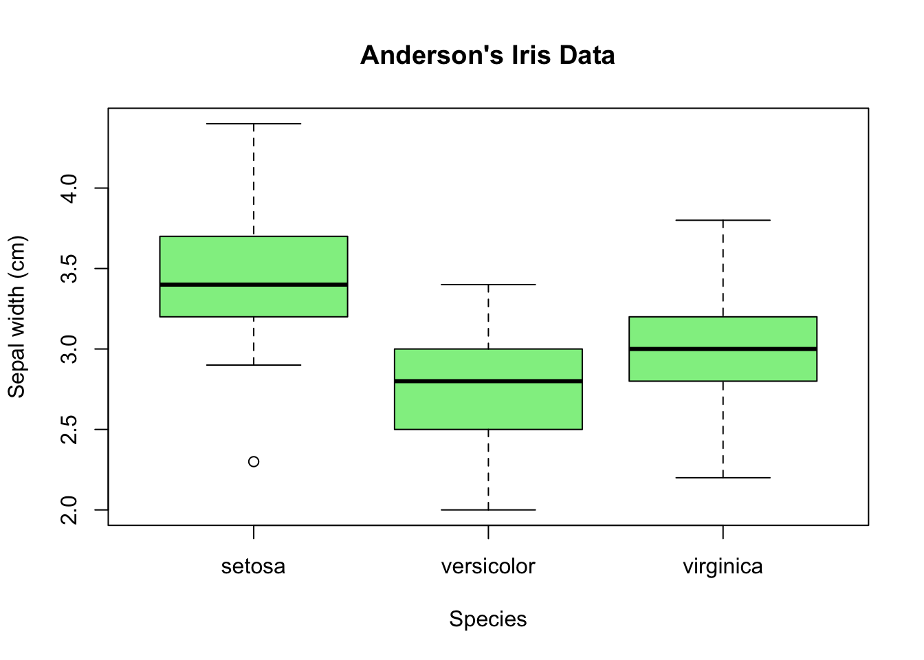
Last time we wrote a script iris.R, in which we made this box plot that shows
how summary statistics such as the median or the range differ between species.
Suppose we now want to see the distribution of the sepal widths for the species
versicolor in more detail.
Let’s first save versicolor’s sepal widths in a variable so that later on we
won’t have to type so much.
Let’s call the variable sw_ver as an abbreviation for “sepal width of
versicolor”.
We assign to it the subset of the values in the column Sepal.Width for which
the value in the Species column equals versicolor.
From tutorial 08, we know how to accomplish this task.
First we take the vector iris$Sepal.Width.
Then we use the logical vector iris$Species == "versicolor" for subsetting.
sw_ver <- iris$Sepal.Width[iris$Species == "versicolor"]Let’s take a brief look at the content of sw_ver by typing the variable name
in the console followed by the return key.
sw_ver## [1] 3.2 3.2 3.1 2.3 2.8 2.8 3.3 2.4 2.9 2.7 2.0 3.0 2.2 2.9 2.9 3.1 3.0 2.7 2.2
## [20] 2.5 3.2 2.8 2.5 2.8 2.9 3.0 2.8 3.0 2.9 2.6 2.4 2.4 2.7 2.7 3.0 3.4 3.1 2.3
## [39] 3.0 2.5 2.6 3.0 2.6 2.3 2.7 3.0 2.9 2.9 2.5 2.8There’s one number for each measurement made by Edgar Anderson.
The command length(sw_ver) confirms that there are 50 measurements
for Iris versicolor, which matches the number we found with the table()
function in tutorial 13.
length(sw_ver)## [1] 50Our goal is to make a histogram of the values in sw_ver.
The command for it is hist(sw_ver).
hist(sw_ver)
Note that, when we use the hist() function, the argument in the parentheses
must be a numeric vector with one number for each observation.
From the histogram in the bottom right pane, we get the impression that the
data are unimodal and a little bit skewed to the left.
We can change the appearance of the histogram by passing more arguments to the
hist() function.
Many of the arguments have the same names that we encountered when we worked
with the boxplot() function.
For example, the argument col = "lightgreen" changes the histogram’s colour
to light green.
hist(sw_ver, col = "lightgreen")
We can change the title with main = and in quotes
"Sepal Width of Iris Versicolor".
hist(sw_ver, col = "lightgreen", main = "Sepal Width of Iris Versicolor")
When we click “Run”, we can see the title at the top of the plot.
The argument for changing the x-axis label is xlab.
Let’s call it “Width (cm)”.
Let’s insert some line breaks to make this command more readable.
hist(sw_ver,
     col = "lightgreen",
     main = "Sepal Width of Iris Versicolor",
     xlab = "Width (cm)")
The order of the arguments `col, main and xlab doesn’t matter.
For example, we may move main in front of col.
hist(sw_ver,
     main = "Sepal Width of Iris Versicolor",
     col = "lightgreen",
     xlab = "Width (cm)")
The plot is still the same.
The only important thing is to keep the data to be plotted (here sw_ver) at
the first position in the argument list.
The appearance of a histogram is greatly influenced by the position of the
breaks between the bins.
In our case, R decided to put the breaks at 2.0, 2.2, 2.4 and so on.
Sometimes it’s worth playing with the break positions ourselves.
We change the breaks by inserting the breaks argument into the hist()
function.
For example, if we want to place the breaks at 2.0, 2.1, 2.2, 2.3 etc. up to 3.4., we write
hist(sw_ver,
     main = "Sepal Width of Iris Versicolor",
     col = "lightgreen",
     xlab = "Width (cm)",
     breaks = c(2.0, 2.1, 2.2, 2.3, 2.4, 2.5, 2.6, 2.7, 2.8, 2.9,
                3.0, 3.1, 3.2, 3.3, 3.4))
The c() function is exactly the same that we’ve used since tutorial 02 to
create vectors.
When we copy and paste only the c() command to the console, it returns 2.0,
2.1 and so on.
c(2.0, 2.1, 2.2, 2.3, 2.4, 2.5, 2.6, 2.7, 2.8, 2.9, 3.0, 3.1, 3.2, 3.3, 3.4)## [1] 2.0 2.1 2.2 2.3 2.4 2.5 2.6 2.7 2.8 2.9 3.0 3.1 3.2 3.3 3.4Sequences with equally spaced numbers such as this one are quite common in R
code.
For this reason, R has a shortcut function to avoid tedious typing: the
seq() function.
seq() takes three arguments: the start and end values of the sequence and the
step width, so the equivalent of the long c() command above is
seq(2.0, 3.4, 0.1).
seq(2.0, 3.4, 0.1)## [1] 2.0 2.1 2.2 2.3 2.4 2.5 2.6 2.7 2.8 2.9 3.0 3.1 3.2 3.3 3.4Let’s copy this command into the breaks argument above.
Make sure that you close as many parentheses as you open.
In this case there are two consecutive closing parentheses at the end.
hist(sw_ver,
     main = "Sepal Width of Iris Versicolor",
     col = "lightgreen",
     xlab = "Width (cm)",
     breaks = seq(2.0, 3.4, 0.1))
Now run the new hist() command so that we can see how the new breaks change
the histogram.
Does it look better?
We can switch between this and the previous figure by clicking the arrows in
the top left of the Plots tab.
When the bins are larger, the distribution looks smoother, so we can see
the overall unimodal shape more clearly, but the smaller bins reveal more
details.
There’s no simple rule how many bins we should use in a histogram.
In fact, it’s good practice to try different bin sizes because they can reveal
different features of the data.
As long as we stay away from extreme choices for the bin sizes, we can set
the bin sizes such that they best support the message we wish to convey.
Let’s summarize what we’ve learned.
- In R, we make histograms with the
hist()function. - There are multiple arguments to the
hist()function that change the histogram’s appearance. For example,colchanges the colour,mainthe title andxlabthe x-axis label.
- The
breaksargument sets the position of the breaks between bins. - A useful function when adjusting histogram breaks is the
seq()function. It creates a regularly spaced sequence between two numbers.
Next time we learn how we can save the histogram plot as a file.
See you soon.